Responsive Web Design Services
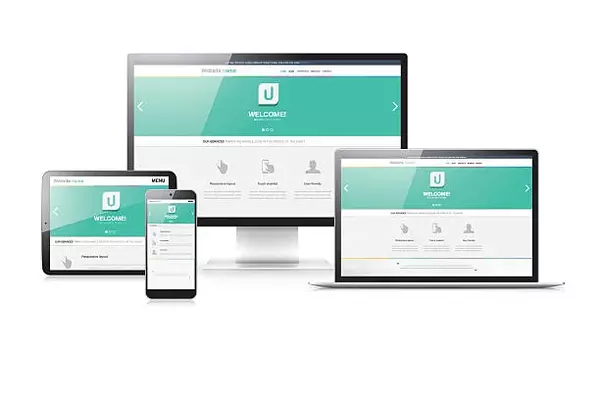
What is Responsive Website Designing?
Have you ever wondered how websites adjust to different devices, like tablets, desktop, iPad or smartphones? Or why your website has trouble doing the same?
The reason for this is simple. If your website is not designed for that function, it will not respond to the needs of the users and the devices they’re using. Not all website owners are aware of responsive web design. 72% people are more likely to stay engaged if your site is mobile ready. Almost 60% of Internet browsing is done through mobile devices. First impressions matter, and this fact is even more important when it comes to websites. 94% of people who say they didn’t trust a website because of its design. Even Google, the giant search engine, considers mobile-friendly websites when it comes to ranking websites based on user searches.

Responsive Website Design Benefits
A responsive website enables the page layout to automatically adjust across a range of screen sizes and has a number of benefits, including:
- Fluid Width – The responsive layout of the website automatically scales to the size of the user’s device, from desktop down to tablet and handheld smartphone. This ensures a positive experience for anyone using the website, regardless device type.
- Ease of Maintenance – Since responsive websites share the same design and content across all devices, maintenance is greatly simplified compared to maintaining separate stand-alone websites for different devices or platforms. Any updates to website content are instantly available on all devices.
- Development Costs – Costs are similar to traditional desktop-only websites, and are primarily dependent upon functional and design requirements. Responsive web design can be challenging initially because you need to address display on multiple screen sizes, but the results are well-worth it.
- Shared Functionality – Any functionality you build can apply to all devices, rather than having to duplicate it for a separate mobile website.
- Search Engine Optimization – SEO practices are simplified with a responsive website because they only need to be applied to a single site. Plus Google recommends responsive web design and having your website become mobile-friendly will help with your Google visibility overall.
Advantages of Responsive Web Design
Mobile-first approach
Content scaling, touch-screen gestures and device-specific keys – all this makes interaction with software on a mobile device completely different from that on a desktop computer. That’s why we tackle mobile and desktop design of your web solution as interconnected yet different entities. Starting from mobile and proceeding with desktop design allows us to easily create web solutions, which fully match in the visual style but have independent user experience that feels natural on all devices.


Driven by your business objectives
Our design team always combines your individual business requirements with the latest responsive website and web portal design trends. Working in close cooperation with you, we discuss all your workflows and business goals before the project launch. This way, we can deliver web designs that meet your most prioritized marketing objectives, including:
Ensured results
We let you picture the business outcomes of our responsive web design services early on in the project. To provide you with factual and reliable data on the prospective results – such as visitor session time, user engagement rate and conversions – we conduct comprehensive market studies, business analysis and user research.

Frequently Asked Questions
We have listed everything for our customers. Still, if you find any doubt, you can connect with us via Email or Social Media Network. Here are answers to some Frequently Asked Questions.
Depending on availability and how fast you can progress, you could start working with a designer within 48 hours of signing up.
We make sure that each engagement between you and your designer begins with a trial period of up to two weeks. This means that you have time to confirm the engagement will be successful. If you’re completely satisfied with the results, we’ll bill you for the time and continue the engagement for as long as you’d like. If you’re not completely satisfied, you won’t be billed. From there, we can either part ways, or we can provide you with another expert who may be a better fit and with whom we will begin a second, no-risk trial.
Our platform hosts a very diverse range of skill sets, experiences, and backgrounds. Our freelancers range from software engineers, user experience design experts, project managers, and product managers to digital marketing strategy and pricing experts who have worked at leading companies. Our designers are user experience experts who are highly skilled in design processes and usability testing. They also have years of experience in mobile website development, creating and optimizing the functionality of responsive web pages, mobile sites, and landing pages.
Besides our talent matching services, we also provide responsive web development services like a responsive web design company. Through our Toptal Projects team, we assemble cross-functional teams of senior project managers, software developers, website designers, and other technical skills. Our team members follow a well-defined development and UX design process to build an user-friendly website.
Responsive websites perform better in search rankings (Google) because they provide a superior user experience over sites that aren’t optimized for both desktop and mobile devices. A flawless user experience across devices is more important than ever, and a highly-skilled responsive web designer is crucial to reach that outcome. Better search rankings mean more visibility, so responsive web design is crucial for gaining traction for your business.
One of the most important things to consider when hiring a responsive web designer is the time you’ll put in to find the right one. Toptal does that work for you, selecting from the top 3% of freelance web designers. Choosing designers who have the right experience can provide a massive advantage over the competition. Toptal’s rigorous vetting process matches you with expert talent customized to fit your needs.
When searching for the right responsive web designer, you’ll want to make sure you’re searching through a trusted source for the highest-caliber designers out there. While many designers will tout responsive web design experience, proof of strong experience and expertise is a must. You can find web designers with extensive experience in responsive web design through Toptal, who will send 2-3 impressive candidates within 24 hours.